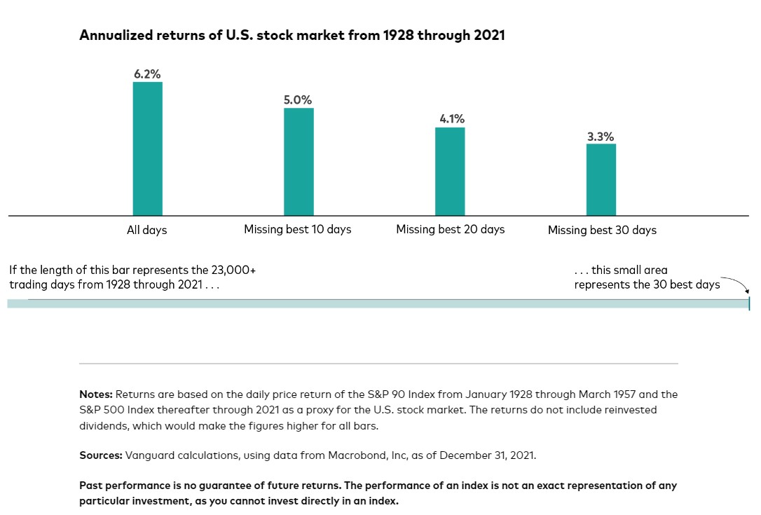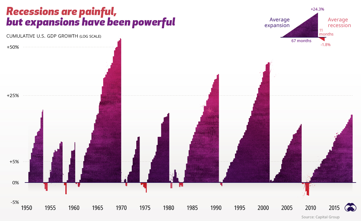
Chart of the Day (16)
Best and Worst Days are Close
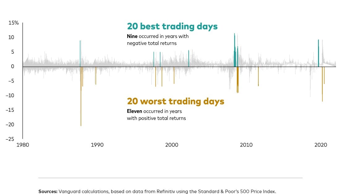
Today’s Chart of the Day comes again from Vanguard. The best and worst trading days are often very close. Usually, when there is a large swing one way, more often than not, the next day swings in the opposite direction. This is why we often do not get too excited when it happens. In fact, when cash needs to be invested or raised for spending, these are usually great days to do so. Vanguard proved this with today's chart.
Read