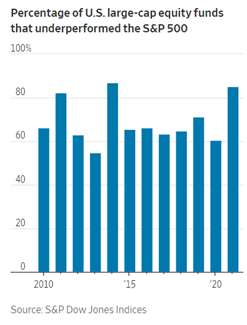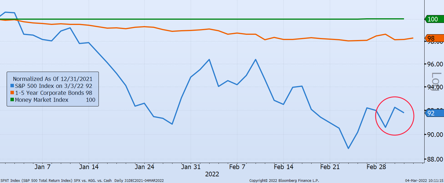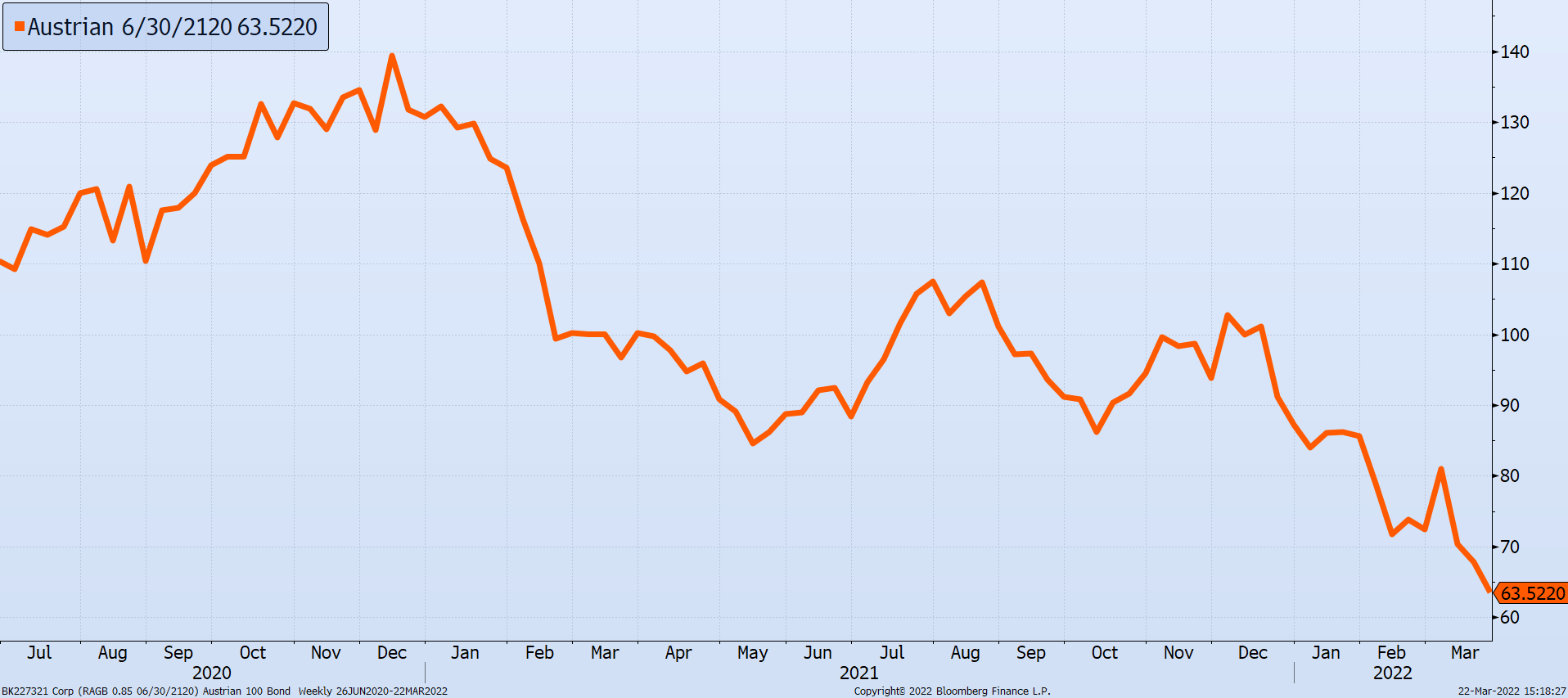
Chart of the Day (18)
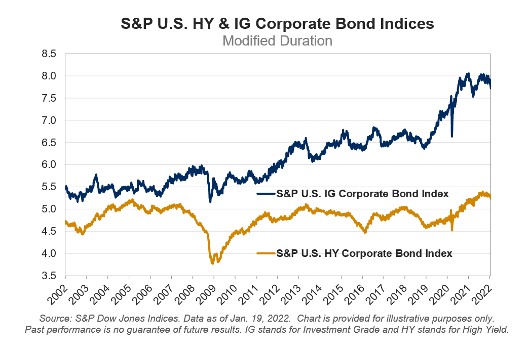
Bond Length Matters
Duration describes the time it takes for a bond holder to get all their money back and/or the change in price for each 1% change in the interest rate.
Read