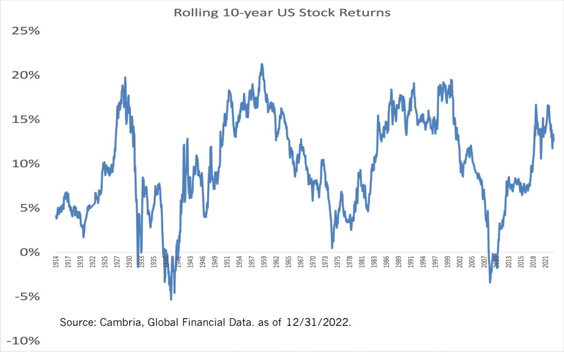
Contact Us
    Browse by topic
    Subscribe to our blog

    Chart of the Day

    Chart of the Day: Good Time to Buy

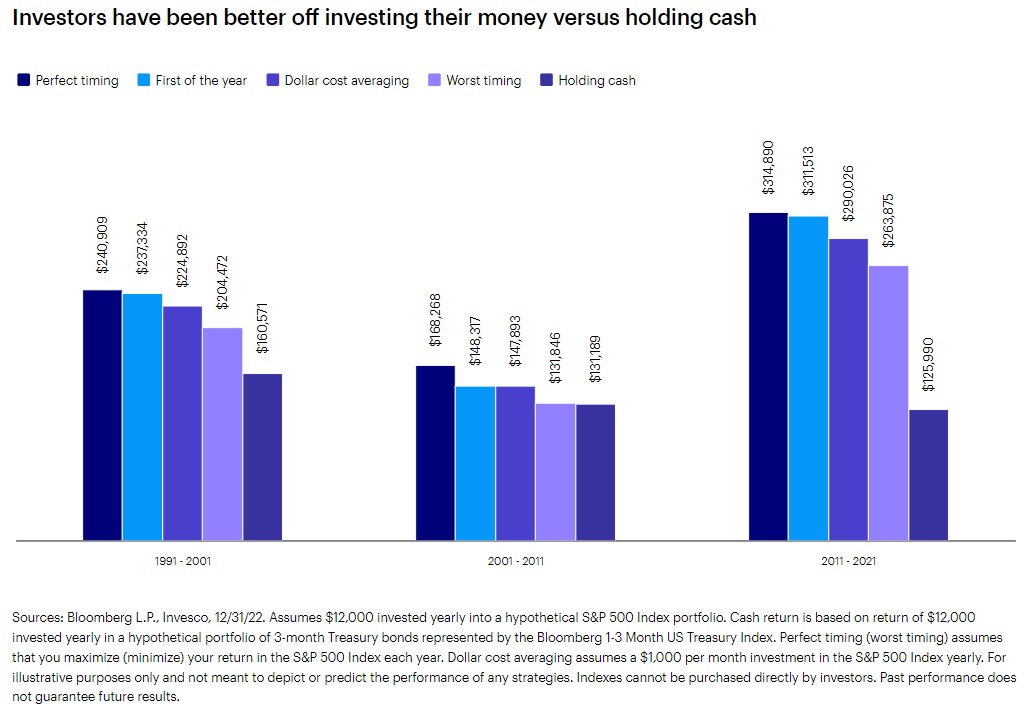
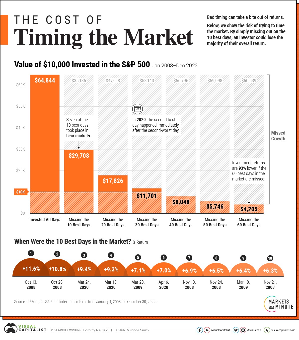
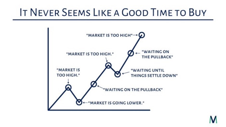
    Today’s Chart of the Day from @MVMoneyVisuals on X, formerly known as Twitter, sums up many of the comments heard by advisors over the years. On a long enough timeline, there has never been a bad time to own stocks for the long-run.
    Read

    Chart of the Day

    Chart of the Day: Hindsight is Always 20/20

    Today’s Chart of the Day is a reminder that investing in the “next big thing” can be fraught with risk, and, in this case, cannabis-related companies are the focus. My finance professor at the University of Florida, Dr. David Nye, always said, “Hindsight is always 20/20,” and in this case, this is very apparent.
    Read

    Chart of the Day

    Chart of the Day: Even Worst Timing is Better than Cash

    Today’s Chart of the Day and commentary is from Invesco and shows three instances when cash balances were high — following the 1991 and 2002 recessions, the 2008 Global Financial Crisis, and the 2009 European debt crisis — and calculates what $12,000 invested yearly in the stock market for 10 years would have been worth.
    Read

    Chart of the Day

    Chart of the Day: Don't Sell When the Market is Down

    Today’s Chart of the Day from Visual Capitalist shows the impact of missing just a few positive days over the last 20 years. If you've followed the blog for a while, you already know that missing just a few days can be devastating to your account.
    Read

    Chart of the Day

    Chart of the Day: Rent Inflation is Down

    Today I have good news for renters.
    Read

    Chart of the Day

    Chart of the Day: Retirement Fall Off

    Today’s Chart of the Day shows how much families have saved for retirement. Roughly 50% have ZERO saved, and only 21% have over $100,000.
    Read

    Chart of the Day

    Chart of the Day: Join the Bond ETF Movement

    Today’s Chart of the Day from BlackRock shows the increasing use of Bond Exchange Traded Funds (ETFs) in the US. Why? Many investors see them as more liquid and they often cost less.
    Read

    Chart of the Day

    Chart of the Day: Inflation by the Decade/Paradigm Shift

    Today’s Chart of the Day comes from Lance Lambert, @NewsLambert on Twitter, who works for Fortune Magazine. The chart shows total inflation by decade going back to the 1990s.
    Read

    Chart of the Day

    Comment of the Day: Aretha Franklin's Will

    I’m going to take a small detour from my typical Chart of the Day to tell a short story of Aretha Franklin’s will.
    Read

    Chart of the Day

    Chart of the Day: Rolling 10-Year Returns

    Today’s Chart of the Day from Cambria shows the rolling 10-year US stock return going back 108 years to 1914. There are two general periods where stocks realized a negative return over a 10-year span: one during the Great Depression in the 1930s and the other during the Great Recession in 2008.
    Read

    Want more articles like this in your inbox?

    Subscribe to our blog for a weekly roundup of our latest financial blogs and resources.