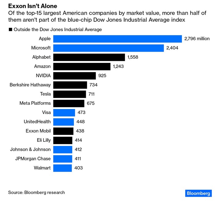
Contact Us
    Browse by topic
    Subscribe to our blog

    Chart of the Day

    Chart of the Day: Exxon vs. Dow

    Today’s Chart of the Day from a Bloomberg article discusses Exxon Mobil's exclusion from the Dow Jones Industrial Average Index. The chart shows that out of the top 15 companies in the United States, more than half, noted in black, are excluded.
    Read

    Chart of the Day

    Chart of the Day: West vs. East Prices

    Today’s Chart of the Day from the Wall Street Journal shows that home prices are falling on the West Coast of the U.S. and rising in the East.
    Read

    Chart of the Day

    Chart of the Day: Real Returns

    Today’s Chart of the Day from J.P. Morgan shows the history of the 10-year Treasury yield and the “real” yield, which is what you have left after you subtract inflation.
    Read

    Chart of the Day

    Chart of the Day: Personal Records

    Today’s Chart of the Day is a great checklist from MarketWatch.com. As an example, I store this information in the notes of “My Card," in Contacts on my iPhone.
    Read

    Chart of the Day

    Chart of the Day: Opportunity in the U.S.

    Today’s Chart of the Day from the Financial Times shows that the U.S. currently makes up about half of the world's stock market.
    Read

    Chart of the Day

    Chart of the Day: Vanishing Banks

    There used to be a bank on every corner; however, today’s Chart of the Day from BlackRock shows a 71% decline in US banks since 1980. Why?
    Read

    Chart of the Day

    Chart of the Day: Don't Chase the Trend

    Today’s Chart of the Day from Bespoke shows the difference in price, excluding dividends, if you owned the S&P 500 only during the day after it went up the previous day (blue) vs. owning it after it went down the previous day (orange).
    Read

    Chart of the Day

    Chart of the Day: GDP Per Person

    Today’s Chart of the Day shows the Gross Domestic Product (GDP) per person growing 2% per year since 1870.
    Read

    Chart of the Day

    Chart of the Day: Pepsi Does Not Just Sell Pepsi

    Today’s Chart of the Day shows 11 of the largest companies and which brands/products they own and distribute.
    Read

    Chart of the Day

    Chart of the Day: Tremendous Equity

    Today’s Chart of the Day shows that a combined 68% of Americans have paid off their mortgage or have at least 50% in equity. If there is a “downturn” in the real estate market, it will not look like ones in the past.
    Read

    Want more articles like this in your inbox?

    Subscribe to our blog for a weekly roundup of our latest financial blogs and resources.