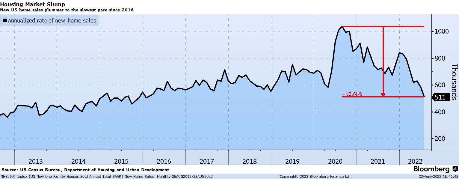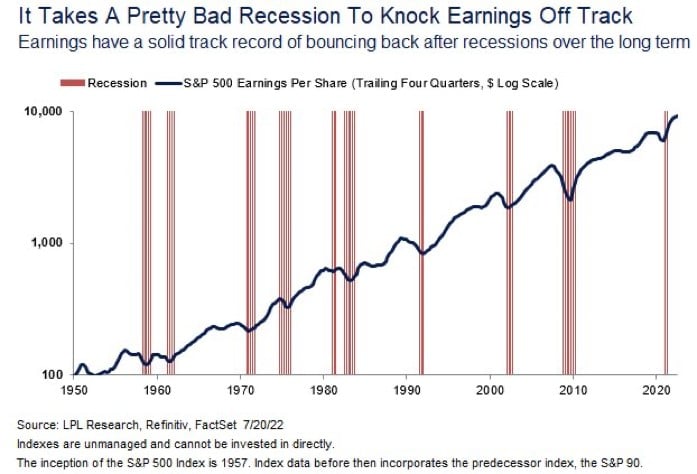
Chart of the Day (15)
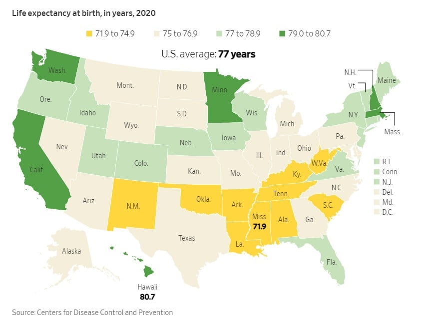
Life Expectancy: 77 Years (Depending)
Today's Chart of the Day comes from an article in the Wall Street Journal which shows the life expectancy at birth based on which state you live in. The lowest was Mississippi at 71.9 years, and the highest was Hawaii at 80.7 years. It's nice to see that Florida was on the higher end at 77.5 years.
Read