Contact Us
    Browse by topic
    Subscribe to our blog

    Chart of the Day (17)

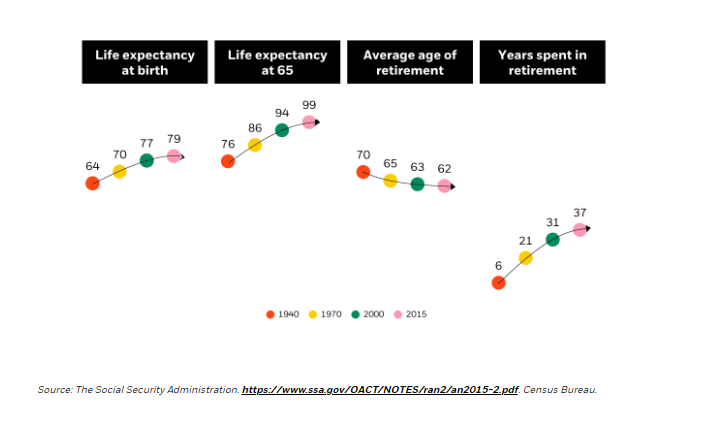
    37 Years of Retirement

    Today’s chart from BlackRock shows that from 1940 to 2015 life expectancy went up 15 years and the average years spent in retirement went from six to 37.
    Read

    Chart of the Day (17)

    Top Heavy = Top Losses

    This chart is from today’s Wall Street Journal. Because of their heavy weights in the S&P 500 index, eight companies make up half of the stock market’s 14% decline year to date. It is notable that the value index was only down 3%, while the technology-heavy growth indexes are down 25%. As usual, the S&P 500, which includes both, splits the difference.
    Read

    Chart of the Day (17)

    Diversification Saves in Down Markets

    The Russell 3000 Index is made up of the largest 2,750 stocks in the United States.
    Read

    Chart of the Day (17)

    Daily Median Income for World

    From 2001 to 2017, the daily median income doubled for everyone in the world.
    Read

    Chart of the Day (17)

    Selling Low

    The rule of thumb is to buy low and sell high.
    Read

    Chart of the Day (17)

    Winning is Hard, Staying a Winner is Even Harder

    S&P Dow Jones Indices has published their updated U.S. Persistence Scorecard. A mere 2.2% of actively managed U.S. domestic equity funds in the top quartile for 12 months performance at the end of 2019 stayed ahead of three-quarters of their peers when measured two years later.
    Read

    Chart of the Day (17)

    Real Estate vs. Stock Market

    Past performance is no predictor of future success, but it is interesting to compare the past performance of different investments. These charts show the value of $100 invested in real estate (red) and the stock market (blue.) The chart above shows that over the last 15 years, the stock market was the place to be.
    Read

    Chart of the Day (17)

    Sale and Dividends

    There are two ways to make money in stocks:
    Read

    Chart of the Day (17)

    100% of the Time

    I think about this chart often during discussions with clients on having too much exposure to single stocks.
    Read

    Chart of the Day (17)

    Real Estate Prices vs. Income

    Real estate is unique since humans need a physical place to live and work. Economics says the price of those physical places is constrained by the cost of the physical labor to build them.
    Read

    Want more articles like this in your inbox?

    Subscribe to our blog for a weekly roundup of our latest financial blogs and resources.