Contact Us
    Browse by topic
    Subscribe to our blog

    Chart of the Day (10)

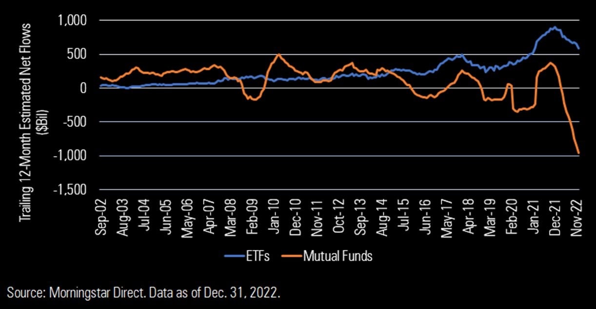
    Chart of the Day: Record Loss for Mutual Funds

    Today's Chart of the Day is from Morningstar, and shows that, during 2022, Exchange Traded Funds (aka ETFs) took in an impressive $500 billion in assets, while mutual funds lost a record $1,000 billion.
    Read

    Chart of the Day (10)

    Chart of the Day: Don't Wait to Feel Better

    Today’s Chart of the Day comes from J.P. Morgan Asset Management. These charts show the last nine recessions, going all the way back to 1961, including the stock market return, unemployment level, and the market’s lowest point during that time period.
    Read

    Chart of the Day (10)

    The Average is Rare

    Today’s Chart of the Day from Jeroen Blokland, @jsblockland on Twitter, shows the distribution of one year of returns from the Dow Jones Industrial Average going back to 1900.
    Read

    Chart of the Day (10)

    Market Pullbacks

    An article from Morningstar has several great charts. (To see them all, click on the link.)
    Read

    Chart of the Day (10)

    Real Estate vs. Stocks Over Long-Term

    Recently, I was asked, "Should we invest in real estate or stocks?" Today’s Chart of the Day is the long-term total return of the FTSE Nareit All REITs Index compiled by FTSE Russell company.
    Read

    Chart of the Day (10)

    Florida is #1

    Today’s Chart of the Day comes from a Wall Street Journal article
    Read

    Chart of the Day (10)

    Risk of Stocks vs. Bonds

    Today’s Chart of the Day comes from @brianferoldi on Twitter who does a great job of making complex things easy to understand.
    Read

    Chart of the Day (10)

    70% Up Over 10 Years

    Today’s Chart of the Day comes from OfDollarsAndData.com and shows the percentage of years with positive returns per 10-year spans going back to 1900.
    Read

    Chart of the Day (10)

    Speculation is Not as Important as Quality

    Today’s Chart of the Day comes from Robert Schiller’s book called Irrational Exuberance, which was summarized by Leandro, @Invesquotes on Twitter.
    Read

    Chart of the Day (10)

    ETFs Are Growing

    Today’s Chart of the Day comes from Morningstar Direct and shows the openings and closings of mutual funds vs. exchange traded funds (ETFs) since 2012.
    Read

    Want more articles like this in your inbox?

    Subscribe to our blog for a weekly roundup of our latest financial blogs and resources.