Contact Us
    Browse by topic
    Subscribe to our blog

    Chart of the Day

    1% Makes a Difference

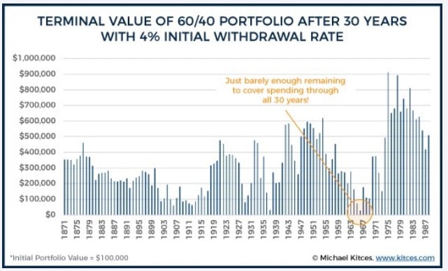
    The two Charts of the Day are from Michael Kitces and show the value of a $100,000 portfolio of 60% stocks and 40% bonds after 30 years with a 4% and 5% initial withdrawal rate. These comments come from Rich Emch, CFP®, Senior Trust Officer.
    Read

    Chart of the Day

    Fixed Income ETFs for the Win

    Today’s chart comes from VettaFi. Fixed income exchange traded funds (aka ETFs) have taken in over $1 trillion in assets over the last seven years, and only had three months of outflows.
    Read

    Chart of the Day

    Hold On To Catch the Upside

    Today's Chart of the Day is from S&P Global, and it shows the weekly returns of the S&P 500 year to date. Yes, cumulatively the market is down, but if you happen to miss the three 6%+ weekly gains out of the last 26 weeks, your total return for the year could look a whole lot different.
    Read

    Chart of the Day

    Recessions are Painful; Expansions are Powerful

    This chart comes from the Visual Capitalist. Since 1950, the average economic expansion lasts 67 months. The average recession, though painful, only lasts 11 months.
    Read

    Chart of the Day

    Small- and Mid- vs. Large-Cap Stocks

    As of today, small- and mid-cap stocks on a year-to-date basis are performing better than their large-cap counterparts by 3% and 2%, respectively. There is an ebb and flow but going all the way back to 1994 small- and mid-cap stocks have outperformed large-cap stocks by an annual 0.66% and 1.49%, respectively. Financial theory supports, and so far this year it is also true, that when you add them to your portfolio they lower your risk due to the additional diversification. Since this follows our motto of obtaining the “highest returns, for the least amount of risk,” we include small- and mid-cap stocks in all our portfolios.
    Read

    Chart of the Day

    The "Chiclets Chart"

    One of our clients calls this the “Chiclets Chart” because of its resemblance to that classic brand of candy-coated chewing gum.
    Read

    Chart of the Day

    Active vs. Passive Funds

    Today’s chart from Morningstar shows annual net flows into passive funds (in purple) vs. active funds (in orange), and their dominance for the last 11 years.
    Read

    Chart of the Day

    37 Years of Retirement

    Today’s chart from BlackRock shows that from 1940 to 2015 life expectancy went up 15 years and the average years spent in retirement went from six to 37.
    Read

    Market Update

    May 2022 Market Update

    Below are a couple of my thoughts on the market.
    Read

    Chart of the Day

    Top Heavy = Top Losses

    This chart is from today’s Wall Street Journal. Because of their heavy weights in the S&P 500 index, eight companies make up half of the stock market’s 14% decline year to date. It is notable that the value index was only down 3%, while the technology-heavy growth indexes are down 25%. As usual, the S&P 500, which includes both, splits the difference.
    Read

    Want more articles like this in your inbox?

    Subscribe to our blog for a weekly roundup of our latest financial blogs and resources.