Contact Us
    Browse by topic
    Subscribe to our blog

    Chart of the Day

    The Shying Away from ESG

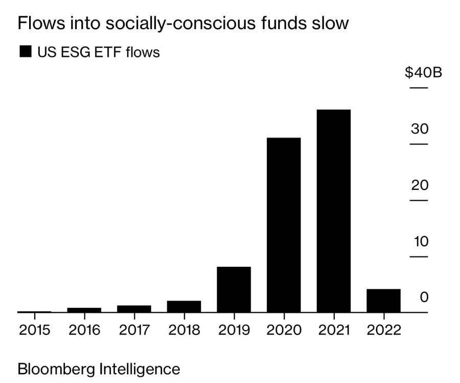
    Today's chart is from Bloomberg Intelligence, which shows the money flows into ESG (Environmental, Social, and Governance) ETFs since they appeared in 2015.
    Read

    Chart of the Day

    No More Heydays for Hedge Funds

    People may ask, “Why not use hedge funds?” Today's chart comes from Bloomberg and shows us the reason why. In addition to their typical expense ratio of 2% and 20% of gains above a benchmark, hedge funds have consistently under performed the stock market, denoted by the S&P 500 index, every year since 2014. In fact, they haven’t performed well since their heydays in the 1980s, and even less so since 2007.
    Read

    Chart of the Day

    S&P 500 vs. Average Investor

    Today's chart comes from OneDigital and shows that the average return for 20-years ending in 2015 was 8.2% for the S&P 500, while the average investor only earned 2.1%. The hypothesis is: Too many investors stop investing when the market is down and/or try to time the market.
    Read

    Chart of the Day

    Total Return Since 1802

    The following chart from Brian Ferdoldi shows the ultra long-term history of real returns from various asset classes dating back to 1802. Real returns, the returns after inflation, are important to know due to inflation’s elevated levels.
    Read

    Chart of the Day

    Hard to Hurt Earnings

    Today's chart comes from LPL Research and shows the growth of company earnings since 1950. When you buy a stock fund you are purchasing the steam of their combined future earnings. Yes, that stream can temporarily decline during recessions, but over time the economy and that stream of earnings returns and continues to grow.
    Read

    Chart of the Day

    Record Real Estate Prices

    Today's Chart of the Day is a Bloomberg chart of the U.S. Median Existing Home Price provided by the National Association of Realtors going all the way back to 1999.
    Read

    Chart of the Day

    Rolling, Rolling, Rolling

    Today's chart is from Ben Carlson’s “A Wealth of Common Sense” which shows the S&P 500’s rolling returns for 3, 10, 20, and 30 year periods going all the way back to 1926.
    Read

    Chart of the Day

    Best and Worst Days are Close

    Today’s Chart of the Day comes again from Vanguard. The best and worst trading days are often very close. Usually, when there is a large swing one way, more often than not, the next day swings in the opposite direction. This is why we often do not get too excited when it happens. In fact, when cash needs to be invested or raised for spending, these are usually great days to do so. Vanguard proved this with today's chart.
    Read

    Chart of the Day

    30 Days Equal Half The Return

    Today’s chart comes from Vanguard. They wrote a great short article on the difficulties of market timing. In a nutshell, "from 1928 through 2021, there were more than 23,300 trading days in the U.S. stock market. Out of those, the 30 best trading days accounted for almost half of the market’s return."
    Read

    Chart of the Day

    Prediction for Year End

    When asked to predict where the market will be at year end, here are my thoughts:
    Read

    Want more articles like this in your inbox?

    Subscribe to our blog for a weekly roundup of our latest financial blogs and resources.