Contact Us
    Browse by topic
    Subscribe to our blog

    Chart of the Day (6)

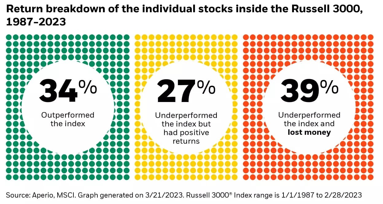
    Chart of the Day: Only One Out of Three

    Today’s Chart of the Day from BlackRock shows that only 34%, or roughly one out of three, stocks outperformed the index for the last 35 years.
    Read

    Chart of the Day (6)

    Chart of the Day: Combined Market Area

    Today’s Chart of the Day is a sidestep from my typical financial ones. The chart shows the combined market area after the Crews family of banks (Charlotte State Bank & Trust, Crews Bank & Trust, Englewood Bank & Trust, and Wauchula State Bank) unify under the Crews Bank & Trust brand in September. To learn more, visit crews.bank/unify.
    Read

    Chart of the Day (6)

    Chart of the Day: 25% of Tasks Done by AI

    Today’s Chart of the Day from Goldman Sachs shows the percentage of tasks per industry that could be automated by artificial intelligence. Administrative tasks are the highest at 46%, with the average across all industries being 25%.
    Read

    Chart of the Day (6)

    Chart of the Day: Housing Affordability

    Today's Chart of the Day from Fortune illustrates the components of housing affordability, which include changes in incomes, rates, and prices. There is an ebb and flow, but currently rates are the primary driver.
    Read

    Chart of the Day (6)

    Chart of the Day: Hurricanes vs. Equator

    Today’s Chart of the Day is not finance related, but still fascinating. Shared by the NASA Earth Observatory, the Coriolis forces at the equator are zero.
    Read

    Chart of the Day (6)

    Chart of the Day: 1.5 Days a Year

    Today’s Chart of the Day is from J.P. Morgan’s updated Guide to Retirement. It calculates your total return having missed the 30 best days for last 20 years ending 2022.
    Read

    Chart of the Day (6)

    Chart of the Day: Tax Share

    Today’s Chart of the Day from the Wall Street Journal shows the share of taxes paid vs. the share of total income. The $100,000-$500,000 range is pretty even, while those making more than $1 million, who only have a 15% share, pay nearly 40% of total taxes.
    Read

    Chart of the Day (6)

    Chart of the Day: When to Take Social Security

    Today’s Chart of the Day from J.P. Morgan shows when to take social security to maximize benefits.
    Read

    Chart of the Day (6)

    Chart of the Day: Motorcycles vs. Cars vs. Planes

    Today's Chart of the Day looks at the statistics of transportation safety. I think everyone already suspects this, but I was surprised by the scale. You are 30 times more likely to die on a motorcycle than in a car. Also, you are 100 times more likely to die in a car than a plane.
    Read

    Chart of the Day (6)

    Chart of the Day: 99% are Under Current Rate

    Today's Chart is from the Primary Mortgage Market Survey (PMMS) from Freddie Mac, the government agency that provides mortgage loans.
    Read

    Want more articles like this in your inbox?

    Subscribe to our blog for a weekly roundup of our latest financial blogs and resources.