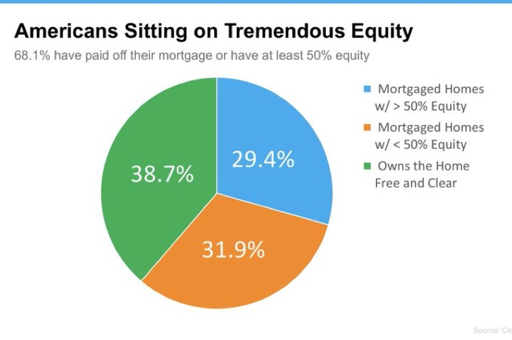
Contact Us
    Browse by topic
    Subscribe to our blog

    Chart of the Day

    Chart of the Day: Tremendous Equity

    Today’s Chart of the Day shows that a combined 68% of Americans have paid off their mortgage or have at least 50% in equity. If there is a “downturn” in the real estate market, it will not look like ones in the past.
    Read

    Chart of the Day

    Chart of the Day: ETFs Win Again

    Today’s Chart of the Day from OliverWyman shows the number of new funds being created each year in the U.S. since 2016.
    Read

    Chart of the Day

    Chart of the Day: Index vs. The World

    Over the last five years, 87% of actively managed funds in the U.S. underperformed their index. Today’s Chart of the Day from S&P Global shows this trend also holds true around the world. Why?
    Read

    Chart of the Day

    Chart of the Day: Stocks since 1980

    Today’s Chart of the Day from iShares by BlackRock shows that, even though we've experienced numerous financial problems along the way, $100,000 invested in the stock market in 1980 grew to $11.2 million today.
    Read

    Real Estate

    Real Estate is Booming on I-4 Corridor. Here's Why.

    The I-4 corridor in central Florida has become increasingly popular in recent years. This area, which stretches from Daytona Beach to Tampa, is home to a diverse range of businesses and industries, making it an attractive location for investors and entrepreneurs.
    Read

    Chart of the Day

    Chart of the Day: History of Bank Failure

    Today's Chart of the Day is the history of bank failures from USAFacts. The year 1989 was the height with 531 banks failing from a savings and loan crisis. For perspective, there have only been three in 2023.
    Read

    Chart of the Day

    Chart of the Day: Debt Ceiling

    Today’s Chart of the Day comes from Morningstar.com. In the last 40 years, the debt ceiling has gone up 53 times.
    Read

    Chart of the Day

    Chart of the Day: First 10 Years vs. Next 10 Years

    Today’s Chart of the Day is from a BlackRock research paper on concentrated portfolio risks. In it, they graph the top 25 performing stocks over the past 10 years, starting from 10 years ago, and their subsequent underperformance over the next 10. (Resulting in their total performance over the last 20 years.)
    Read

    Buying a home

    Details on Federal Mortgage Fee Adjustments

    I have been fielding many questions regarding the newest Federal Housing Finance Agency (FHFA) fee structure and how it affects your borrowing potential. I will try to answer some of the most common questions.
    Read

    Chart of the Day

    Chart of the Day: 4.2% Withdrawal Rule

    Today's chart from Morningstar shows there is a 90% chance you would not run out of money during your life following these projected safe withdrawal rates based on equity weightings.
    Read

    Want more articles like this in your inbox?

    Subscribe to our blog for a weekly roundup of our latest financial blogs and resources.