Contact Us
    Browse by topic
    Subscribe to our blog

    Chart of the Day

    Chart of the Day: 1.5 Days a Year

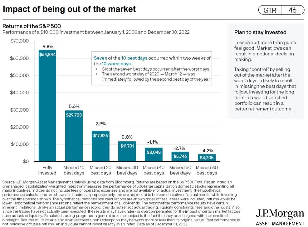
    Today’s Chart of the Day is from J.P. Morgan’s updated Guide to Retirement. It calculates your total return having missed the 30 best days for last 20 years ending 2022.
    Read

    Chart of the Day

    Chart of the Day: Tax Share

    Today’s Chart of the Day from the Wall Street Journal shows the share of taxes paid vs. the share of total income. The $100,000-$500,000 range is pretty even, while those making more than $1 million, who only have a 15% share, pay nearly 40% of total taxes.
    Read

    Business

    How to Use Credit Cards Responsibly: 5 Things to Do

    Using a personal credit card can seem complicated, especially if you’re working to build credit. It’s a balance between spending enough to build your credit history, but not overspending and going into debt. Challenging? Sure, but definitely not impossible. Here are our five tips for using your credit card responsibly.
    Read

    Real Estate

    HELOC 101: Is It Right For You?

    A Home Equity Line of Credit (HELOC) is a popular and versatile financing option that allows homeowners to access the equity in their homes as collateral to obtain a line of credit. This credit line can be used for a variety of purposes, including home improvement projects, debt consolidation, and unexpected expenses. In this article, we will explore the basics of HELOCs, how they work, and the benefits of using this type of financing.
    Read

    Chart of the Day

    Chart of the Day: When to Take Social Security

    Today’s Chart of the Day from J.P. Morgan shows when to take social security to maximize benefits.
    Read

    Chart of the Day

    Chart of the Day: Motorcycles vs. Cars vs. Planes

    Today's Chart of the Day looks at the statistics of transportation safety. I think everyone already suspects this, but I was surprised by the scale. You are 30 times more likely to die on a motorcycle than in a car. Also, you are 100 times more likely to die in a car than a plane.
    Read

    Chart of the Day

    Chart of the Day: 99% are Under Current Rate

    Today's Chart is from the Primary Mortgage Market Survey (PMMS) from Freddie Mac, the government agency that provides mortgage loans.
    Read

    Chart of the Day

    Chart of the Day: History of Nuclear Arsenals

    Today's Chart of the Day looks at the number of nuclear stockpiles in the United States and the USSR/Russia dating back to the 1950s.
    Read

    Chart of the Day

    Chart of the Day: The Great Exodus Continues

    Today’s Chart of the Day from Bloomberg shows the net growth of Exchange Trade Funds (ETFs), in blue, versus the loss from Mutual Funds, in black. Last year was especially brutal when the downturn allowed investors to finally exit their positions with less capital gain.
    Read

    Chart of the Day

    Chart of the Day: 20+ Years of Inflation

    Today’s Chart of the Day is from @Mark_J_Perry on Twitter and is called, “The Chart of the Century.” It shows price changes of various goods and services from January 2000-June 2022 and the private sector doing a good job making things more affordable.
    Read

    Want more articles like this in your inbox?

    Subscribe to our blog for a weekly roundup of our latest financial blogs and resources.