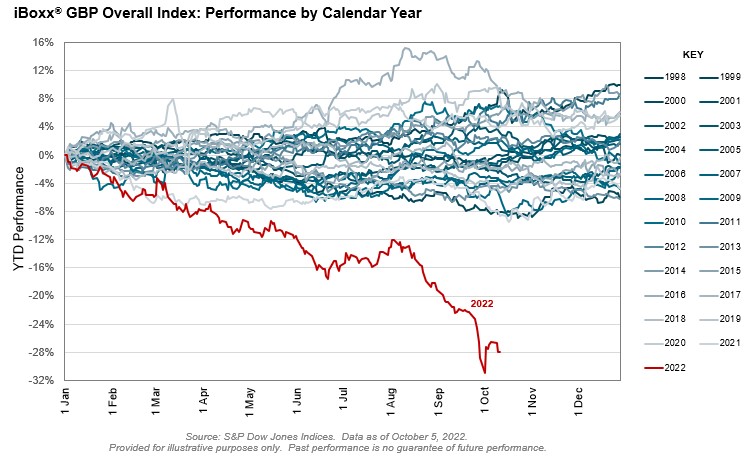
Contact Us
    Browse by topic
    Subscribe to our blog

    Chart of the Day

    The Trouble with Treasuries

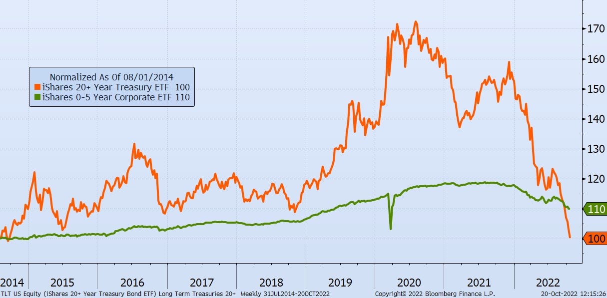
    It’s been a challenging few years for Long-Term Treasury Bonds, which are defined as bonds that have maturities of 20+ years and are noted in orange on today's Chart of the Day. Since 2020, they have lost 42% of their value, erasing all the accumulated value for the last six years.
    Read

    Chart of the Day

    Why Pay More and Earn Less?

    Today’s Chart of the Day comes from S&P Dow Jones Indices and shows the cumulative savings from using index funds vs. actively managed funds, as well as the growth of indexed funds since 1996. Index funds have reached a staggering $7 trillion in total assets. Since active funds costs more vs. indexed funds, investors have saved an equally impressive $400 billon in fees, which is more than the entire market value of Wal-Mart. The reason for growth in index funds? Since S&P started keeping score 20 years ago, only a paltry 6% of active funds have outperformed them. As you can see in the chart, more and more are starting to say, “Why pay more and earn less?” and moving their investments accordingly.
    Read

    Chart of the Day

    Elevated Premiums in Mortgages

    The history of the Mortgage Banker’s 30-Year Home Rate, in blue, going all the way back to when they started the index in 1990 is displayed in today's Chart of the Day.
    Read

    Chart of the Day

    Bondmaggeddon

    The Chart of the Day is from S&P Global. As eternal optimists, which has worked for our clients over the last 20+ years, we like to say, “It could always be worse.” Though the United States equivalent investment grade bond index in the US is down 20%, the iBoxx GPB (which stands for the Great Britain Pound) bond index is down 28%, which is the worst in 25 years. They are calling it “the Bondmaggeddon.” Though we may have some of these US equivalent bond ETFs in the portfolio we manage, they are more than offset by many shorter-term bonds, which in most cases have resulted in a total loss of only 6%. Still not great, but it could have been worse.
    Read

    Chart of the Day

    The Ebb and Flow

    The following Chart of the Day from State Street Global Advisors shows the flow of funds in investments going all the way back to 2001.
    Read

    Chart of the Day

    Washington Makeup

    Today's Chart of the Day is a second chart from the Capital Group article called “Can midterm elections move markets?”
    Read

    Chart of the Day

    Midterm Swings

    Today’s Chart of the Day comes from a Capital Group article called “Can midterm elections move markets?”
    Read

    Chart of the Day

    Less, but Still a Fat Tail Risk

    Today’s Chart of the Day from Bloomberg shows that though there are less nuclear stockpiles than the 1980’s, there are still too many. There is an increased focus on this topic due to Putin’s threats and a hope that someone would come to their senses before anything gets out of hand.
    Read

    Chart of the Day

    Stocks After Inflation Peaks

    Today's Chart of the Day is in a BlackRock article. This is the organization who issues the iShares Exchange Traded Funds (ETFs) in our portfolios.
    Read

    Community Bank

    More Than a Sense of Hope: Unity in the Midst of Disaster

    Life-changing events have a way of narrowing one’s perspective on what is actually important. The recent hurricane that took the path of the Crews family of banks has done just that for all of us here.
    Read

    Want more articles like this in your inbox?

    Subscribe to our blog for a weekly roundup of our latest financial blogs and resources.