Contact Us
    Browse by topic
    Subscribe to our blog

    Chart of the Day

    Least Regretted Majors

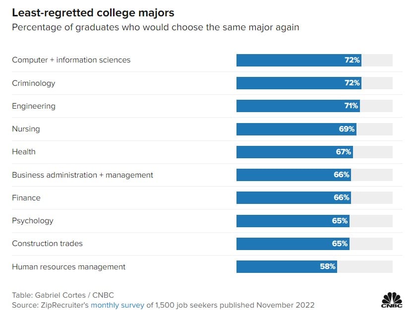
    As high school seniors finish out the school year, some may be asked, “What are you going to major in at college?” Today’s Chart of the Day comes from CNBC.com who surveyed 1,500 job seekers for the percentage of graduates who would choose the same major again. The article also included the “most regretted” majors; however, you’ll have to click on the link to see that.
    Read

    Chart of the Day

    Bonds to ETFs

    We often talk about how over the last 10+ years investors have, in general, been moving out of mutual funds and into Exchange Traded Funds, also known as ETFs. However, this year the pattern is even more prevalent with bonds. So far this year, a record $446 billion exited bond mutual funds and went into bond ETFs and bank accounts. Why do we use bond ETFs instead of actively managed bond mutual funds? Bond ETFs have substantially lower costs, more liquidity, increased transparency, and over the last 10 years had a better return than 90% of actively managed mutual funds.
    Read

    Chart of the Day

    Car Prices Are Falling

    Today’s Chart of the Day is from S&P Dow Jones Indices.
    Read

    Chart of the Day

    The Fence Paradox

    Today’s Chart of the Day is an infographic from Pasquale Cirillo, @DrCirillo on Twitter. We see this often when investors say, “They wouldn’t be allowed to sell this, if it wasn’t safe.” Yes, there needs to be fences, but don’t let their security lull you into forgetting the risks on the other side.
    Read

    Chart of the Day

    That's a lot of Down Time

    Today’s chart comes from Wealthmanagement.com. It shows the drawdowns, which is the percent the market is down from the previous record high, going back to 1970. As you would expect, the chart shows most the time the market is “down” and investors spend a lot of time having “lost” money.
    Read

    Chart of the Day

    Longer Equals Higher Probability

    Today’s chart from JP Morgan Asset Management’s Guide to the Markets quarterly presentation shows the cumulative returns based on 1, 5, 10, and 20 years for all stocks (in green), all bonds (in blue), and a 50/50 mix (in grey) since 1950. Essentially, the longer you hold your investments, the higher probability you have of positive returns. In fact, there was never a period over 20 years that any of the options lost money. The chart also shows the average annual total return for stocks was an impressive 11.5% during last 20 years. It will be interesting to see how the next 20 years look.
    Read

    Chart of the Day

    Worst Since 1788

    Today's chart comes from Bank of America’s Global Investment Strategy team. We have all heard that this was a bad year for longer term bonds, but how bad? Well, for the 10-year treasury this is the worst year since 1788, so basically the worst year ever. The reason is, since the beginning of this year, the yield went from 1.50% to the current 4.00%, which equates to a 166% increase, causing the price to fall an incredible 20%.
    Read

    Chart of the Day

    China's Lost 30 Years

    Today's chart from Refinitive shows that over the last 30 years, China has delivered a cumulative return of zero dollars, meaning $100 invested 30 years ago is still worth only $100 today.
    Read

    Chart of the Day

    Crypto / FTX Bankruptcy

    Today we’re taking a quick side note away from the Chart of the Day to make a couple of comments on cryptocurrencies and FTX’s bankruptcy. FTX is a popular online cryptocurrency exchange, and its bankruptcy may turn out to be the biggest in history.
    Read

    Chart of the Day

    Stocks for The Long Run

    This chart shows the value of $1 going all the way back to 1802 and was previously shared as a Chart of the Day. However, I'd like to share it once again as the figures were updated to include data from 2021. The chart was created by Jeremy Seigel in his book called “Stocks for the Long Run” published in 2014.
    Read

    Want more articles like this in your inbox?

    Subscribe to our blog for a weekly roundup of our latest financial blogs and resources.