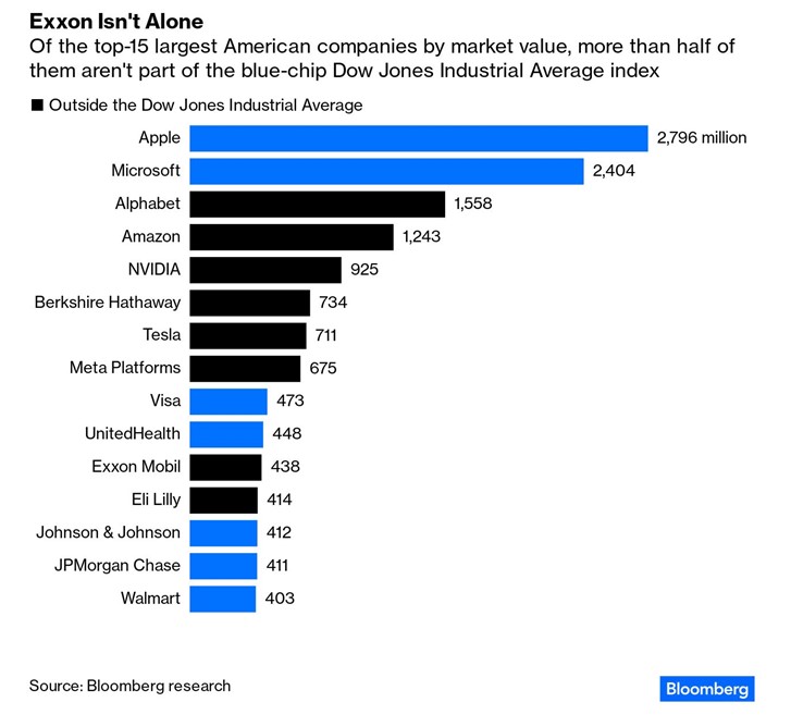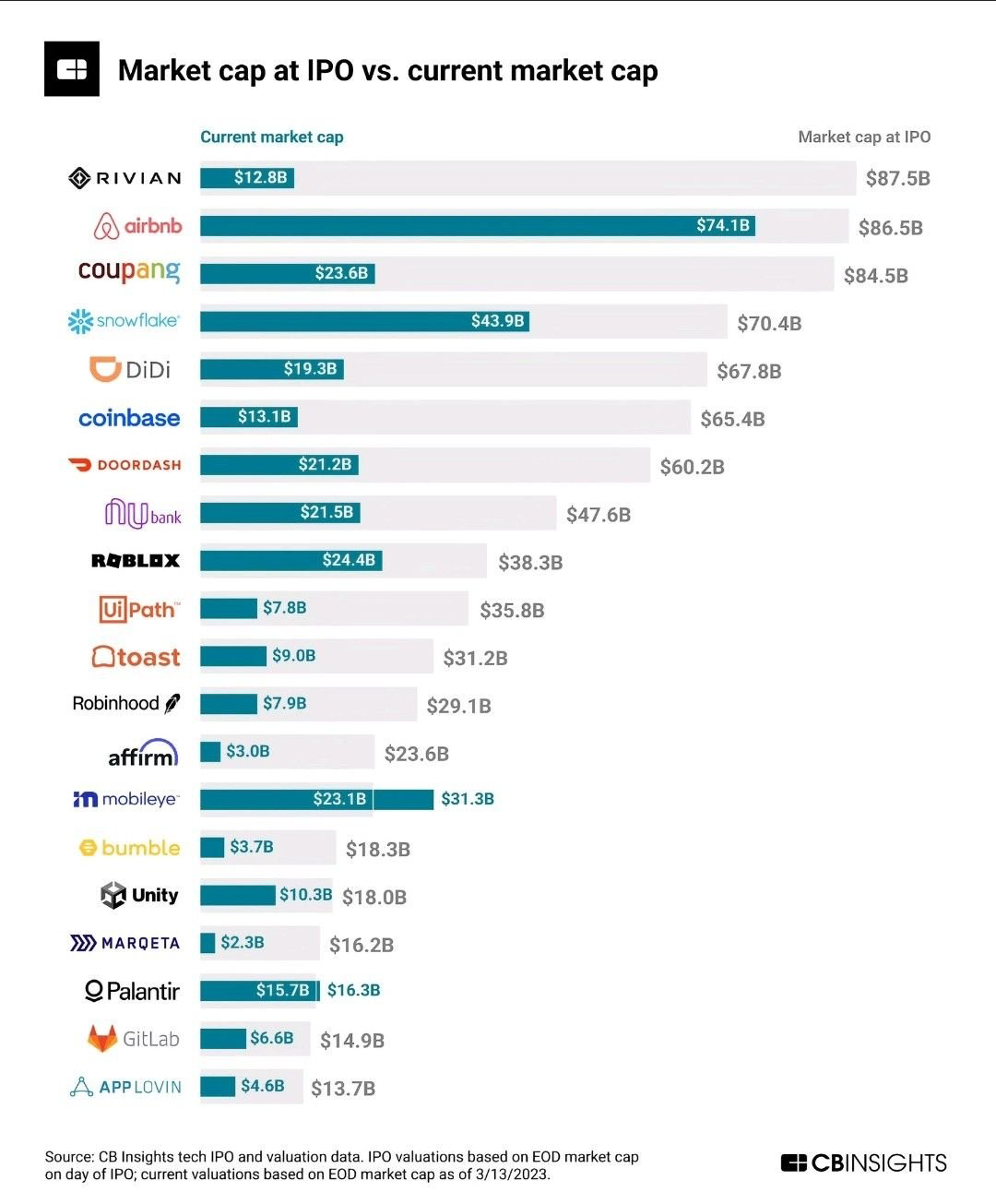
Chart of the Day (3)
Chart of the Day: Invest from the Start
Today’s Chart of the Day comes from @QCompounding on Twitter and shows the value of some well-known companies now vs. when they became publicly owned.
Read