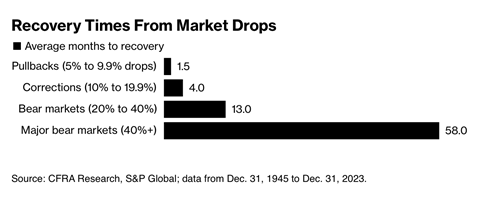
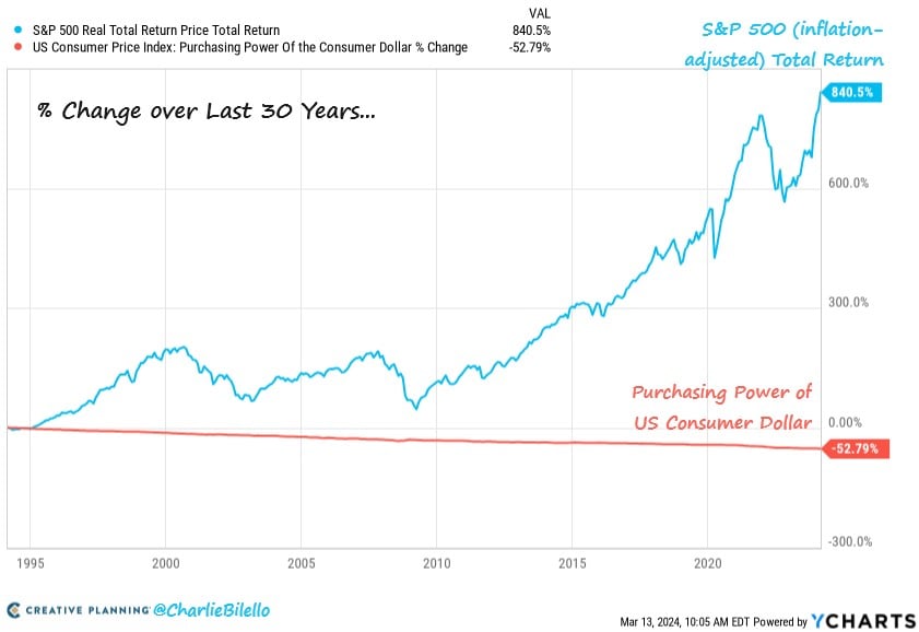
Skip to content
Follow us on Instagram @crews_bank.
Get Started 863-222-7005
Browse by topic
Subscribe to our blog

Chart of the Day

Chart of the Day: Inflation vs. Stocks

Today’s Chart of the Day comes from Charlie Bilello with information from YCharts. Over the last 30 years, inflation reduced the value of a dollar by 50%.
Read

Chart of the Day

Chart of the Day: Names/Times of Market

Today’s Chart of the Day from CFRA Research goes all the way back to 1945 and shows the average number of months it takes to “recover” from market declines.
Read

Chart of the Day

Chart of the Day: Holding Period

Today’s Chart of the Day is from Dresdner Kleinwort Macro Research and notes the average holding period of stocks since 1920.
Read

Chart of the Day

Chart of the Day: 20% Increase in Insurance

Today’s Chart is from Charlie Bilello, with data from the US Bureau of Labor, showing that auto insurance has increased more than 20% from last year.
Read

Chart of the Day

Chart of the Day: Increasing Chances To Reach Age 100

Today’s Chart of the Day shows the percentage of people who have reached the age of 100.
Read

Chart of the Day

Chart of the Day: 25% More for Food

Today’s Chart of the Day is from the Wall Street Journal utilizing data from the Labor Department, showing that you are not imagining things; there has been a cumulative 25% increase in the cost of groceries and dining out since 2020. The article also notes we are at a 30-year high, with 11% of disposable income allocated towards spending on food, stemming from higher labor and food costs. Finally, increased minimum wages coming into effect could exacerbate the issue.
Read

Chart of the Day

Chart of the Day: Number of Real Estate Agents

Today’s Chart of the Day comes from Dr. Torsten Slok from Apollo and shows the number of real estate agents per 1,000 jobs.
Read

Chart of the Day

Chart of the Day: Family Size is Shrinking

Today's chart, sourced from Apollo and the Census Bureau data, illustrates a decline in the average family size from 3.3 members per household in 1960 to 2.5 in 2023.
Read

Chart of the Day

Chart of the Day: Age vs. Salary Saved

Today’s Chart of the Day comes from Yahoo Finance with estimates by Fidelity. It shows a general rule of thumb for financial planning for how much you should have invested at different ages by multiplying your current salary by a specific number (based on your age) to prepare for retirement. Investments can also include things like real estate, businesses, and future inheritances.
Read

Chart of the Day

Chart of the Day: All Stocks Index

Today’s Chart comes from an article in Barron’s with information from Wilshire Indexes. The “Wiltshire 5000” is an index similar to the S&P 500, with the difference being that instead of the largest 500 stocks in the S&P, the Wiltshire 5000 represents all of the investable stocks in the United States. Some argue the Wilshire 5000 is a better representation of the health of the stock market, but that is a longer discussion for another day. 
Read

Want more articles like this in your inbox?

Subscribe to our blog for a weekly roundup of our latest financial blogs and resources.