Best vs. Worst
Contents
About the Author

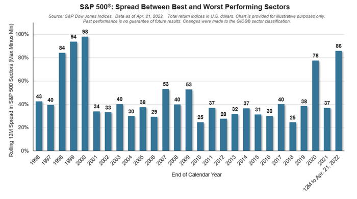
Some investment managers promote a strategy called “Sector Rotation” where they try to time the market by trading between the 11 major sectors of the economy. The gains can be tempting, but the risk is high. For instance, if you owned all energy stocks, you would be up +40% year to date, but if you thought communications was the place to be, you would be down -20%. This is a possible difference of 60% in your returns. According to the chart, which includes more sub sectors, the difference is the highest since 2000.
Numerous studies show that you would have the same chances of success as these investment managers by simply flipping coins. In the long run, the risk adjusted returns from a well balanced portfolio is a safer way to invest in the market.
And oddly enough, in 2000, energy was down -30% and communications were up +30% -- the same difference as today of 60%.
Samuel serves as Senior Vice President, Chief Investment Officer for the Crews family of banks. He manages the individual investment holdings of his clients, including individuals, families, foundations, and institutions throughout the State of Florida. Samuel has been involved in banking since 1996 and has more than 20 years experience working in wealth management.
Investments are not a deposit or other obligation of, or guaranteed by, the bank, are not FDIC insured, not insured by any federal government agency, and are subject to investment risks, including possible loss of principal.